

1. Firstly, click on Template from the menu and select Simple layout and Apply to Blog.

2. From blogger admin, click on Template > Edit HTML from the menu and search for the following code:
</b:section>Until you've found the code that has class='header':


3. Add the following code after you've found the code above (Add after </b:section>) (Also, change the images link to your own images as highlighted in red below):
 <div class='off-canvas-wrap'>
    <div class='desktop_head'>
   <img class='animated_logo go' src='https://blogger.googleusercontent.com/img/b/R29vZ2xl/AVvXsEhu_YHA3InIHNE-ozeTyeZMHKxIw9OhtUUm-T79lEZtvErCmcnZTpmBcULivOj7QpcfMHNdLRSWWwMj1d4u5a0MzWaWsjPJQbMkp7FJ3wcKH-oPg3mlXpgusTi8U3ceDeujc851DJO_Ggb1/s1600/cupid.png'/>
   <img src='https://blogger.googleusercontent.com/img/b/R29vZ2xl/AVvXsEgyHQt_DPhQJVyCApjrsQ5dRDxvqI43EgguWJoNyXv7SfzwYouCVBKWwI8rvpIrjtEcCE0B2ySz54S75UFis5Sq5y50GMvzy7KiBWFG-G0Wy4a_LLH9skyU4jbXbCWqL7hanYZz5gjwboKU/s1600/bg-text.jpg'/></div>
   <div class='mobile_head'></div>
 </div>
Create a new post, choose the image icon and upload your images. Once inserted into post, right click the image and inspect element (f12 browser inspector) to get the url which you can then use to replace the image url highlighted in red above.

4. Click on Template > Customize from the menu

5. Choose Advanced > Add Css and paste below code into the (Add Custom CSS) textarea, once done, click on Apply to Blog

 /** animated logo **/
 body {
   margin: 0
 }
 img {
   max-width: 100%;
   height: auto
 }
 img {
   -ms-interpolation-mode: bicubic
 }
 .off-canvas-wrap {
   -webkit-backface-visibility: hidden;
   position: relative;
   width: 100%;
   overflow: hidden
 }
 .off-canvas-wrap.move-right,
 .off-canvas-wrap.move-left {
   min-height: 100%;
   -webkit-overflow-scrolling: touch
 }
 /**
 **/
 .mobile_head {
   display:none;
 }
 .animated_logo {
   position: absolute;
   left: 5%;
   max-height: 100%;
 }
 .animated_logo.go {
   animation: floating 4s ease infinite;
   -webkit-animation: floating 4s ease infinite;
   -moz-animation: floating 4s ease infinite;
 }
 /* @media screen and (max-width: 40em) {
   .mobile_head {
     display:block;
   }
   .desktop_head {
     display:none;
   }
 } */
 @-webkit-keyframes floating{
   from {-webkit-transform:translate(0, 0px);}
   65% {-webkit-transform:translate(0, 15px);}
   to {-webkit-transform: translate(0, -0px);  }
 }
 @-moz-keyframes floating{
   from {-moz-transform:translate(0, 0px);}
   65% {-moz-transform:translate(0, 15px);}
   to {-moz-transform: translate(0, -0px);  }
 }
 @keyframes floating{
   from {transform:translate(0, 0px);}
   65% {transform:translate(0, 15px);}
   to {transform: translate(0, -0px);  }
 }
 .content-inner {
 padding:0px !important;
 }
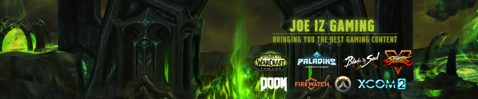
6. Sample banner in action (The white background will not appear in header once implemented, it will be transparent):
7. To address mobile version of your blog you can replace the entire code from
<b:section class='header' id='header' maxwidgets='1' name='Header' showaddelement='no'> ... </b:section> with below code (Remember to rename the title to your Blog Title as highlighted in red below):
<b:section class='header' id='header' maxwidgets='1' name='Header' showaddelement='no'>
<b:widget id='Header1' locked='true' title='Joe Iz Gaming Blog (Header)' type='Header'>
<b:includable id='main'>
<b:if cond='data:useImage'>
<b:if cond='data:imagePlacement == "BEHIND"'>
<!--
Show image as background to text. You can't really calculate the width
reliably in JS because margins are not taken into account by any of
clientWidth, offsetWidth or scrollWidth, so we don't force a minimum
width if the user is using shrink to fit.
This results in a margin-width's worth of pixels being cropped. If the
user is not using shrink to fit then we expand the header.
-->
<b:if cond='data:mobile'>
<!--Show the image only-->
<div id='header-inner'>
<a expr:href='data:blog.homepageUrl' style='display: block'>
<img expr:alt='data:title' expr:height='data:height' expr:id='data:widget.instanceId + "_headerimg"' expr:src='data:sourceUrl' expr:width='data:width' style='display: block'/>
</a>
<!--Show the description-->
<b:if cond='data:imagePlacement == "BEFORE_DESCRIPTION"'>
<b:include name='description'/>
</b:if>
</div>
<b:else/>
</b:if>
<b:else/>
</b:if>
<b:else/>
</b:if>
</b:includable>
<b:includable id='description'>
<div class='descriptionwrapper'>
<p class='description'><span><data:description/></span></p>
</div>
</b:includable>
<b:includable id='title'>
<b:if cond='data:blog.url == data:blog.homepageUrl'>
<data:title/>
<b:else/>
<a expr:href='data:blog.homepageUrl'><data:title/></a>
</b:if>
</b:includable>
</b:widget>
</b:section>
* Make sure you click and expand all the black arrows (as screenshot below) and highlight the entire code and replace it.
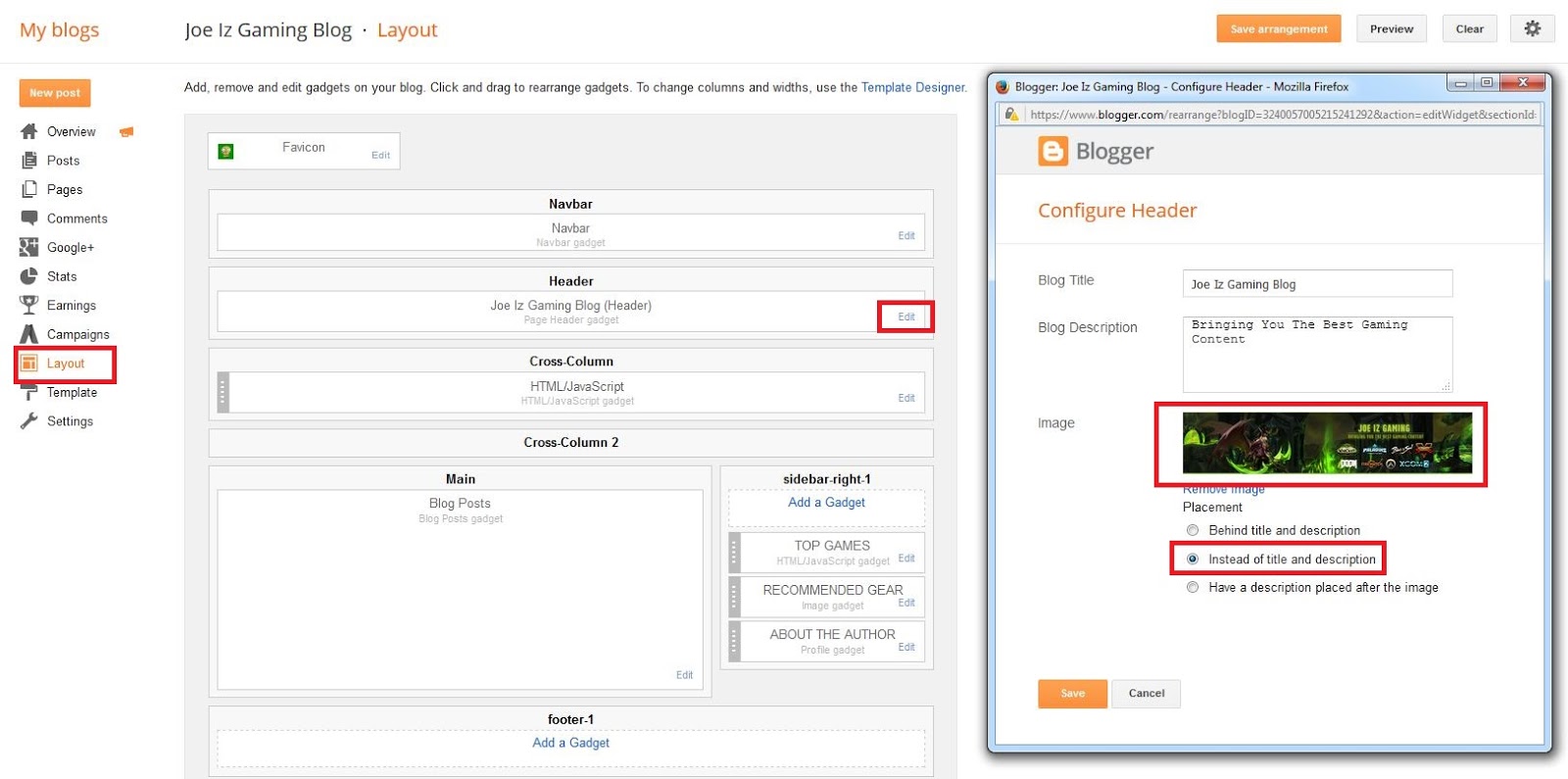
8. You should now be able to upload the banner image for mobile version, to do this, Click on Layout from the menu, Edit the Header and upload your mobile image and choose Instead of title and description and click on Save. Alternatively, you can display just text or text and both description using the other available options.
I hope this post is helpful to anyone that wish to create animated header banner or logo for their blogger website. Have a great one!

One of the additionally intriguing attractive signs was a sign molded like a drop of blood-a few of these were scattered everywhere throughout the auto.
ReplyDeleteMagnetskilte design
This comment has been removed by a blog administrator.
DeleteThank you so much for your post. This post really help me a lot and I have learnt some new things from your blog.
ReplyDeleteMobile Development
Thank you! :)
ReplyDeleteI was able to find good information from your blog posts.
ReplyDeleteAvid Technosys
nice work
ReplyDeleteWow i like your blog You can find more tricks and news here http://www.tricksntipsnp.tk/
ReplyDeletehttp://www.tricksntipsnp.tk/
ReplyDeleteHi, is it possible to add a youtube video into the banner image?
ReplyDeleteGreat Blog which gave the guidance for
ReplyDeletecustom banners.
Thanks and Keep Updating.
Thank you sooo much for this post...so easy to follow!! Custom Banners Toronto
ReplyDeleteGreat Article!!! Waiting for the new updates.
ReplyDeleteIs Selenium Easy To Learn
How To Learn Selenium
This comment has been removed by a blog administrator.
ReplyDelete